Excel
Installing Data Analysis ToolPak
-
Click File, Options

-
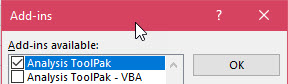
Select Add-ins from the menu on the left. At the bottom of the window, select Excel Add-ins for Manage and click Go

-
Check the box for Analysis ToolPak and click OK.
-
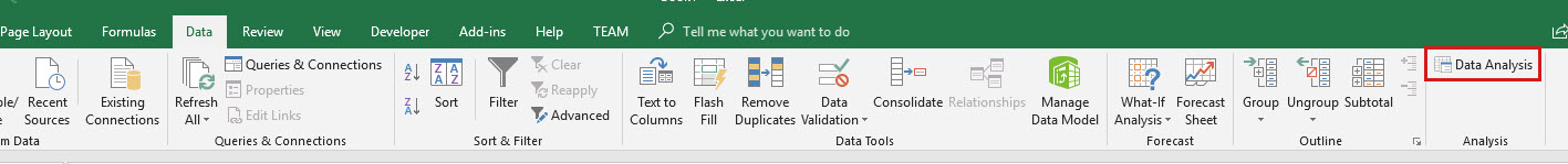
You will now have a button for Data Analysis in the Analysis section of the Data tab.
ANOVA
One-Way
-
Make sure you have the Data Analysis ToolPak installed.
-
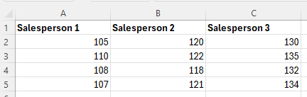
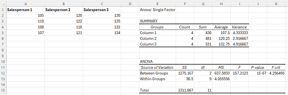
Enter the data for the different groups into separate columns.
-
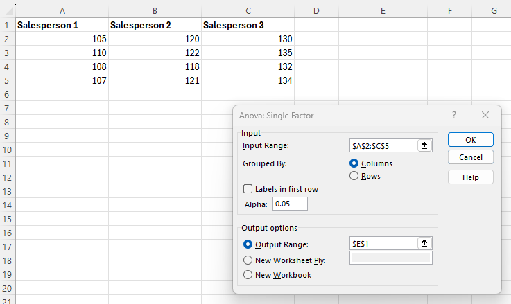
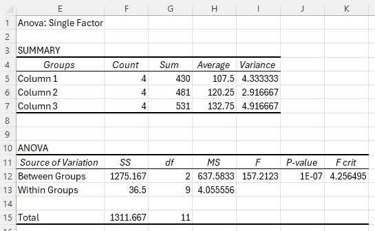
Navigate to the Data tab, and select Data Analysis in the Analyze section. In the dialogue box that appears, select Anova:Single Factor and click OK.
-
-
Enter the Input Range (in this example, cells A2:C5).
-
Enter a value for Alpha.
-
Select Output Range and enter a cell in the spreadsheet for Excel to enter the results.
-
-
Click OK.
Fisher's LSD
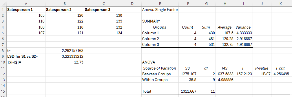
Note: These instructions assume a sample size of 4. Adjust the rows in the instructions to fit your data.
-
Put the data for the samples in columns A, B, and C.
-
Follow the instructions to calculate a One-Way ANOVA and place the output in cell E1.
-
In cell B8, type the formula "=T.INV(probability, degrees of freedom)" using the following information.
-
Enter a probability of 1-α/2.
-
Enter degrees of freedom nτ - k, where nτ is the total number of observations and k is the number of treatments.
-
For this example, α is 0.05 and nτ - k is 9, so the formula is "=T.INV(0.975,9)".
-
-
In cell B9, calculate Fisher's LSD for comparing the means of Salesperson 1 and Salesperson 2 by typing "=B8*SQRT(H13*((1/COUNT(A2:A5))+(1/COUNT(B2:B5))))".
-
In cell B10, calculate for comparing Salesperson 1 to Salesperson 2 by typing "=ABS(H5-H6)".
-
Compare cell B10 to B9 to determine if the means are different for Salesperson 1 and Salesperson 2.
Tukey's HSD
Note: These instructions assume a sample size of 4. Adjust the rows in the instructions to fit your data.
-
Put the data for the samples in columns A, B, and C.
-
Follow the instructions to calculate a One-Way ANOVA and place the output in cell E1.
-
Use a table to find the q critical value corresponding to α, the number of treatments k, and the degrees of freedom nτ - k, where nτ is the total number of observations. Enter this value in cell B8.
For this example, α is 0.05, the number of treatments is 3, and the degrees of freedom are 9, so the associated q critical value is 3.949.
-
In cell B9, calculate Tukey's HSD for comparing the means of Salesperson 1 and Salesperson 2 by typing "=B8*SQRT((H13/2)*((1/COUNT(A2:A5))+(1/COUNT(B2:B5))))".
-
In cell B10, calculate for comparing Salesperson 1 to Salesperson 2 by typing "=ABS(H5-H6)".

-
Compare cell B10 to B9 to determine if the means are different for Salesperson 1 and Salesperson 2.
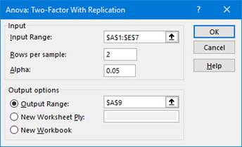
Two-Way
-
Make sure you have the Data Analysis ToolPak installed.
-
Enter your data in the following format.
A B C D E 1 25-35 35-45 45-55 55-65 2 0-5 22 25 34 37 3 27 35 36 43 4 5-10 34 35 42 49 5 36 45 48 51 6 10-15 39 40 53 51 7 41 50 57 59 -
-
Navigate to the Data tab, and select Data Analysis in the Analyze section.
-
In the dialogue box that appears, select either Anova:Two-Factor With Replication (Factorial Design) or Anova: Two-Factor Without Replication (Randomized Block Design), depending on the wording of the problem.
-
Click OK.
-
-
-
Enter the Input Range (in this example, cells A1:E7).
-
Enter the number of Rows per sample.
-
Enter a value for Alpha.
-
Select Output Range and enter a cell in the spreadsheet for Excel to enter the results.
-
-
Click OK.
Binomial Distribution
Binomial Probability (pdf)
-
Type the formula "=BINOM.DIST(number of successes (x), number of trials (n), probability of success (p), FALSE)". Press Enter.
Note: You may enter a 0 in place of FALSE.
In the example pictured, the student was asked to compute the probability of 2 successes out of 4 trials, with each trial having a 1/6 probability of success.
Binomial Probability Distribution
-
Enter the values 0 to n in column A.
-
In cell B1 type the formula "=BINOM.DIST(A1, number of trials (n), probability of success (p), FALSE)". Press Enter.
Note: You may enter a 0 in place of FALSE.
-
Drag cell B1 down to calculate the probabilities for all values of x in column A.
In the example pictured, the student was asked to compute the probability distribution of 4 trials, with each trial having a 1/6 probability of success.
Binomial Probability (cdf)
-
Type the formula "=BINOM.DIST(number of successes (x), number of trials (n), probability of success (p), TRUE)". Press Enter.
Note: You may enter a 1 in place of TRUE.
In the example pictured, the student was asked to compute the probability of 2 or fewer successes out of 4 trials, with each trial having a 1/6 probability of success.
Chi-Square Distribution
Critical Value
-
Type the formula "=CHISQ.INV.RT(probability, degrees of freedom)". Press Enter.
The chi-square critical value with area to the right equal to the probability entered is returned.
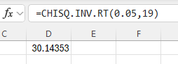
In the example pictured, the student was asked to compute the critical value of a chi-square distribution with 19 degrees of freedom and a significance level of 0.05.
Left Tailed Probability (cdf)
Used for finding the p-value corresponding to a test statistic.
-
Type the formula "=CHISQ.DIST(x, deg_freedom, TRUE)". Press Enter.
The area to the left of the value x is returned.
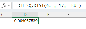
In the example pictured, the student was asked to compute the probability that a chi-square random variable with 17 degrees of freedom is less than 6.3.
Right Tailed Probability (cdf)
Used for finding the p-value corresponding to a test statistic.
-
Type the formula "=CHISQ.DIST.RT(x, deg_freedom)". Press Enter.
The area to the right of the value x is returned.
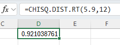
In the example pictured, the student was asked to compute the probability that a chi-square random variable with 12 degrees of freedom is more than 5.9.
Test for Association
-
Enter the given contingency table of observed values in cells A1 through F4.
-
Calculate the expected value for each cell in the contingency table.
-
In cell B7 type the formula "=B$4*$F2/$F$4".
Note that the $ symbol is used to “lock” the column or row that follows the $ when a formula is copied from one cell and pasted into another.
-
Click on the bottom right corner of cell B7, and drag the cursor down to cell B8.
Highlight cells B7 and B8. Click on the bottom right corner of cell B8, and drag the cursor right to cell E8.
-
-
Calculate the p-value.
In cell B9 type the formula "=CHISQ.TEST(B2:E3,B7:E8)".
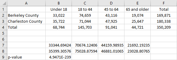
Note the cell numbers given in these instructions are based on a test of four categories that are divided into two groups. To perform a test on a different number of categories or groups, use the appropriate number of columns and rows.
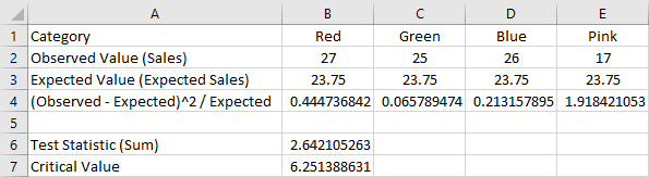
Test for Goodness of Fit
-
Enter the observed value and the expected value for each category in cells B1 through E3 as follows.
-
In cells B1 through E1 enter the category name.
-
In cells B2 through E2 enter the observed value for the category above.
-
In cells B3 through E3 enter the expected value for the category above.
-
-
Calculate the test statistic (χ2).
-
Compute for each category.
-
In cell B4 enter: =(B2-B3)^2/B3
-
Drag across the formula in B4 to cells C4:E4.
-
-
Add together all the values computed in part (a).
-
In cell B6 enter: =SUM(B4:E4)
-
-
-
Calculate the χ2 critical value.
-
In cell B7 enter: =CHISQ.INV.RT(alpha, df)
-
Substitute a value for ‘alpha’.
-
‘df’ is the number of categories minus 1.
-
-
Note the cell numbers given in these instructions are based on a test on four categories. To perform a test on a different number of categories, use the appropriate number of columns.
Confidence Intervals
Proportion
-
In cells B2, B3, and B4 enter the number of successes, number of observations, and alpha, respectively.
-
-
Compute the sample proportion by typing "=B2/B3" in cell B5. Press Enter.
-
Compute the standard deviation by typing "=SQRT(B5*(1-B5))" in cell B6. Press Enter.
-
Compute the critical value by typing "=CONFIDENCE.NORM(B4, B6, B3)" in cell B7. Press Enter.
-
-
To find the confidence interval, subtract and add the critical value to the sample proportion.
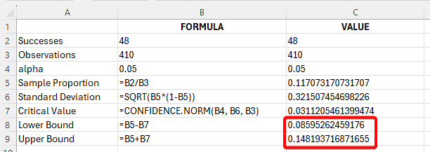
In the example pictured, the student was asked to construct the 95% confidence interval for the population proportion of a normal population if the number of successes is 48 and the number of observations is 410.
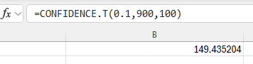
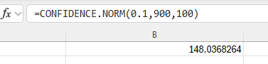
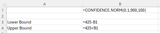
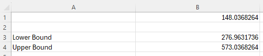
t-Interval
-
Type the formula "=CONFIDENCE.T(alpha, standard_dev, size)". Press Enter.
The error of estimation is returned.
-
To find the confidence interval, subtract and add the error of estimation to the sample mean.
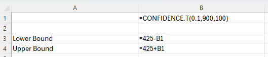
In the example pictured, the student was asked to construct the 90% confidence interval for the population mean of a normal population if the sample standard deviation is 900, the sample mean is 425, and the sample size is 100.
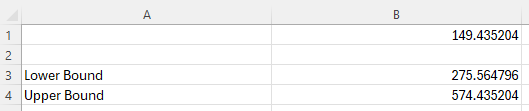
z-Interval
-
Type the formula "=CONFIDENCE.NORM(alpha, standard_dev, size)". Press Enter.
The error of estimation is returned.
-
To find the confidence interval, subtract and add the error of estimation to the sample mean.
In the example pictured, the student was asked to construct the 90% confidence interval for the population mean of a normal population if the population standard deviation is 900, the sample mean is 425, and the sample size is 100.
Two Sample Proportions z-Interval
-
Type the formula "=NORM.S.INV(confidence level)*SQRT((p1*(1-p1))/n1+(p2*(1-p2)/n2))". Press Enter.
Note that the confidence level used in the function 1 – (alpha/2).
The error of estimation is returned.
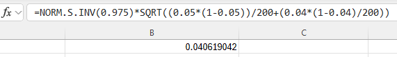
-
To find the confidence interval, subtract and add the error of estimation to the point estimate.
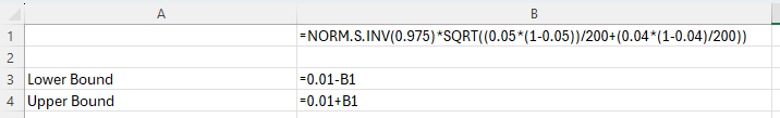
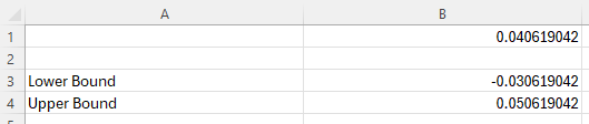
In the example pictured, the student was asked to construct the 95% confidence interval for the difference in two population proportions if the sample proportions are 0.05 and 0.04 for Population 1 and Population 2, respectively. The sample size for each sample proportion is 200.
Two Sample t-Interval (Dependent Samples, Paired Difference)
-
In column A, enter the data from Sample 1. In column B, enter the data from Sample 2.
-
In cell C1, type the formula "=A1-B1". Press Enter.
Drag cell C1 down to calculate all of the paired differences.
Note, double-clicking on the bottom right corner of cell C1 will auto-fill the appropriate formula for the entire column.
-
See Descriptive Statistics, One Variable to calculate the sample mean, standard deviation, and sample size of the data in column C.
-
See Confidence Intervals, t-Interval to calculate the confidence interval.
Counting
Combination
-
Type the formula "=COMBIN(total number of items, number chosen)". Press Enter.
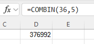
In the example pictured, the student was asked to compute the number of ways to select 5 items out of 36 total items, disregarding the order of the items.
Factorial
-
Type the formula "=FACT(number)". Press Enter.
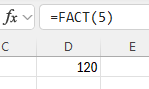
In the example pictured, the student was asked to compute 5!.
Permutation
-
Type the formula "=PERMUT(total number of items, number chosen)". Press Enter.
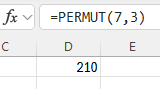
In the example pictured, the student was asked to compute the number of ways to select 3 items out of 7 total items, where the order of the items matters.
Data Manipulation
Filtering
-
Making sure to reserve the first row for headers (or otherwise left empty), enter the data in a column. (If your data covers multiple parameters, then enter the data for each parameter in separate columns.)
-
Select the header/empty row and use one of the following methods:
-
Under Home > Editing click Sort & Filter > Filter.
-
Under Data > Sort & Filter click Filter.
-
-
Click the small arrow in the column you wish to filter by to access your filtering options.
-
A list will be shown of all the unique values in the column (up to 10,000). When the checkbox for a value is selected, the rows where this column has that value will be displayed. You can select any number of these checkboxes at any time.
-
There are also Number Filters or Text Filters, depending on the type of data, that are useful for selecting multiple values that fit a certain criteria.
-
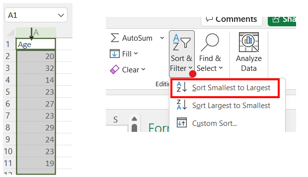
Sorting
-
Enter the values in a single column and select the data.
-
Use one of the following methods to sort the data:
-
Right-click and select Sort > Sort Smallest to Largest, or Sort > Sort Largest to Smallest.
-
Under Home > Editing, choose Sort & Filter > Sort Smallest to Largest or Sort & Filter > Sort Largest to Smallest.
-
Under Data > Sort & Filter, choose
 or
or  .
.
-
Subset Calculations
Suppose you have the numbers 1, 2, 3, …, 20 in a column of data and you have filtered this column to only include the even values (2, 4, 6, …, 20). If you want to sum these values, you might try typing =SUM(, and selecting the visible range. However, you will end up with =SUM(A3:A21), which returns 209; the sum including the non-visible cells.
To avoid this issue, you can use the SUBTOTAL function. Type =SUBTOTAL(109,A3:A21), which will return 110; the sum of only the visible cells.
The 109 is the code to access the SUM function for visible cells. There are several functions for visible subsets built into SUBTOTAL.
101 – AVERAGE
102 – COUNT
103 – COUNTA
104 – MAX
105 – MIN
106 – PRODUCT
107 – STDEV.S
108 – STDEV.P
109 – SUM
110 – VAR.S
111 – VAR.P
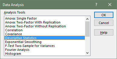
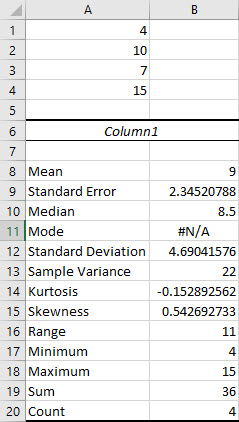
Descriptive Statistics
One Variable
-
Make sure you have the Data Analysis ToolPak installed.
-
Enter the data arranged in a column.
-
Navigate to the Data tab, and select Data Analysis in the Analyze section. In the dialogue box that appears, select Descriptive Statistics and click OK.
-
-
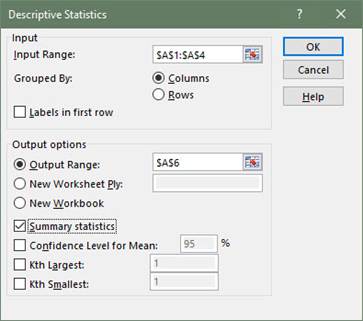
Enter the Input Range by clicking and dragging your cursor over every cell containing data.
-
Check the option for Summary Statistics.
-
Select Output Range and enter a cell in the spreadsheet for Excel to enter the results.
-
-
Click OK.
Two Variable
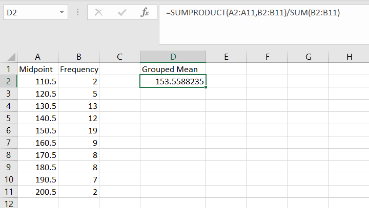
Grouped Data
-
Enter the data in two separate columns: midpoints in column A and frequency values in column B.
-
Use the formula: =SUMPRODUCT([midpoint array], [data array])/SUM([data array]).
-
Press Enter.
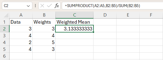
Weighted Mean
-
Enter the data in two separate columns: data values in column A and weights in column B
-
Use the formula: =SUMPRODUCT([data array], [weight array])/SUM([weight array])
-
Press Enter.
F-Distribution
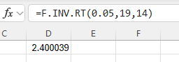
Critical Value
-
Type the formula "=F.INV.RT(probability, numerator degrees of freedom, denominator degrees of freedom)". Press Enter.
The F critical value with area to the right equal to the probability entered is returned.
F-Probability (cdf)
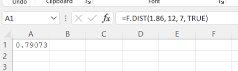
Left Tail Probability
-
Type "=F.DIST(x, numerator degrees of freedom, denominator degrees of freedom, cumulative)". Press Enter.
Note, in the last term of the formula, type TRUE for cdf (cumulative) or FALSE for pdf.
-
The area to the left of the x value is returned.
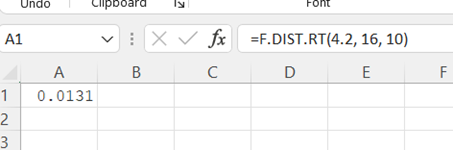
Right Tail Probability
-
Type "=F.DIST.RT(x, numerator degrees of freedom, denominator degrees of freedom)". Press Enter.
-
The area to the right of the x value is returned.
Frequency Distribution
Qualitative Frequency Distribution
-
Select the column of data you wish to create a frequency distribution with, including the column header.
-
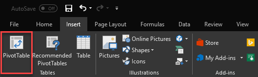
With the data highlighted, under the Insert tab, click PivotTable.
-
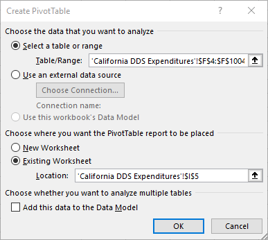
In the PivotTable dialogue box, make sure that the correct range of data is selected, and select the location where you want your PivotTable to appear. Click OK.
-
Now, a blank PivotTable will appear in the specified location, and a pane titled PivotTable Fields will be shown on the right side of the window. The name of the highlighted column will appear in the upper portion of the Fields pane.
-
To create a frequency distribution of the qualitative variable you selected, drag the column name in the upper part of the Fields pane down to the area in the lower part of the pane with the label Rows. In the PivotTable, you will now see a list of the possible unique values within the data you selected.
-
Now, drag the same column name from the upper portion of the pane to the lower portion with the label Values. Make sure the variable in the Values area is summarized by count. This can be specified by clicking the dropdown arrow next to the variable name and opening the Value Field Settings dialogue box. Once the correct functions are set, the count, or frequency, of each unique value in your selected data column will now be displayed in the table, thus making it a qualitative frequency distribution.
Quantitative Frequency Distribution
-
Select the column of data you wish to create a frequency distribution with, including the column header.
-
With the data highlighted, under the Insert tab, click PivotTable.
-
In the PivotTable dialogue box, make sure that the correct range of data is selected, and select the location where you want your PivotTable to appear. Click OK.
-
Now, a blank PivotTable will appear in the specified location. When you click on the PivotTable, a pane titled PivotTable Fields will be shown on the right side of the window. The name of the selected data column will appear in the upper portion of the Fields pane.
-
To create a frequency distribution of the quantitative variable you selected, drag the column name in the upper part of the Fields pane down to the area in the lower part of the pane with the label Rows. In the PivotTable, you will now see a list of the possible unique values within the data you selected. If your data is continuous, this table will probably have more rows than desired. This will be fixed when we group the data at the end.
-
Now, drag the same column name from the upper portion of the pane to the lower portion into the box with the label Values. Make sure the variable in the Values box is summarized by count. This can be specified by clicking the dropdown arrow next to the variable name in the Values box and opening the Value Field Settings dialogue box. Select Count and click OK.
-
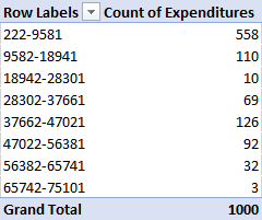
Once the correct functions are set, the count, or frequency, of each unique value in your selected data column will now be displayed in the table. However, since our data is continuous, we need to group the data by creating bins. Right-click on a cell in the Row Labels column of the PivotTable, and select the Group option.
-
In the Group dialogue box, specify your desired starting and ending values as well as the class width, denoted by the term By:.
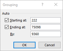
-
Click OK. Now, your data should be grouped into classes, and the frequency count of each class should be displayed in the PivotTable.
Graphs
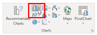
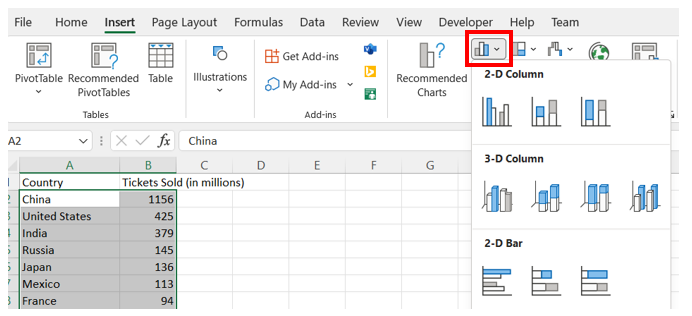
Bar Charts
-
Organize the data into 2 columns, the labels on the left and the values for each label on the right.
-
Select all the data. Then, under the Insert tab, in the Charts group, select the Bar Chart symbol. Choose either 2-D Column > Cluster Column (vertical) or 2-D Bar > Cluster Bar (horizontal).
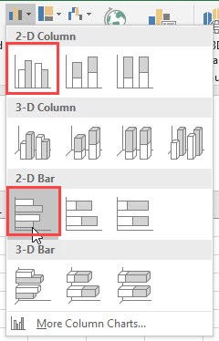
-
You may edit the chart title by clicking on the text of the title.

-
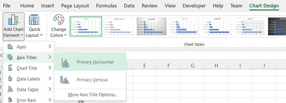
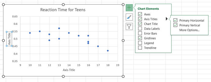
To add axis labels, click on the chart to display the Chart Design tab. Use Add Chart Element to select Axis Titles > Primary Horizontal or Axis Titles > Primary Vertical.

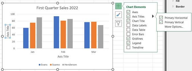
Side by Side Bar Charts
-
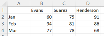
Organize the data into columns with the labels for the groups that you want to appear on the x-axis in the first (leftmost) column and the values for each group label in the columns to the right with labels for the legend in the first row.
-
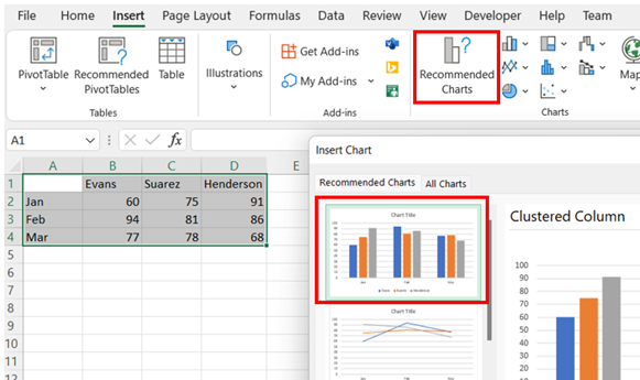
Select all the data. Then, under the Insert tab, in the Charts group, select Recommended Charts. Choose the Clustered Column chart shown.
-
You may edit the chart title by clicking on the text of the title. To add an axis title, click anywhere on the chart, select the + icon to the right of the chart, check Axis Titles, and then Primary Horizontal and Primary Vertical. You may edit the axis titles by clicking on the text of the title.

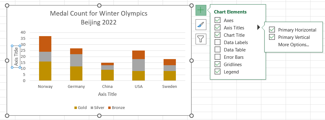
Stacked Bar Charts
-
Organize the data into columns with the labels for the groups that appear on the x-axis in the first row and the data values for each label in the column below. The labels for the legend should be in the first column.
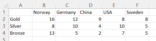
-
Select all the data. Then, under the Insert tab, in the Charts group, select Recommended Charts. Choose the Stacked Column chart shown.
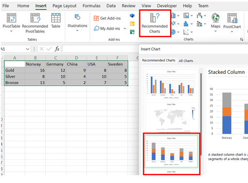
-
To change the colors used in the graph, right-click on the appropriate portion of the bar/column, select Fill and choose the desired color. Repeat for the other segments of the bar/column.

-
You may edit the chart title by clicking on the text of the title. To add an axis title, click anywhere on the chart, select the + icon to the right of the chart, check Axis Titles, and then Primary Horizontal and Primary Vertical. You may edit the axis titles by clicking on the text of the title.

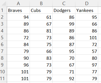
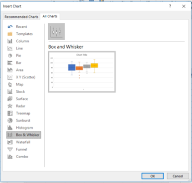
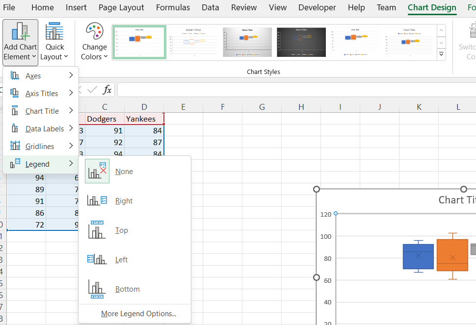
Box Plot
-
Organize the data for each box plot in a separate column.
-
To create the box plot, select Insert and then Recommended Charts. Go to the All Charts tab and select Box & Whisker, then OK.
-
You may edit the chart title by clicking on the text of the title.

-
If you are displaying more than one box plot, then you should add a legend. Using the Chart Design tab, Add Chart Element, and select Legend. You have several options of where to place the legend on the chart.
-
The value of 1 along the horizontal axis can be removed by selecting it and deleting it.

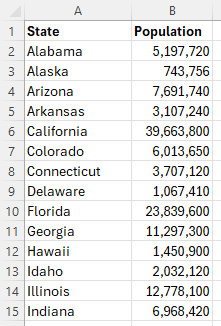
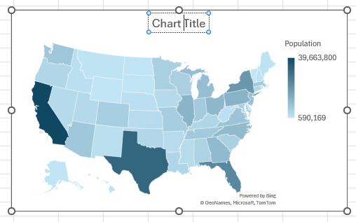
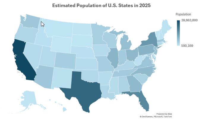
Choropleth Map
-
Organize the data into two columns, the geographic regions on the left and the data values corresponding to each region on the right.
-
Highlight all the data in both columns. Then, under the Insert tab, in the Charts group, select Maps. Choose the Filled Map chart shown.
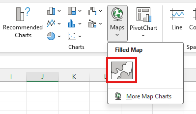
-
You may edit the chart title by clicking on the text of the title.
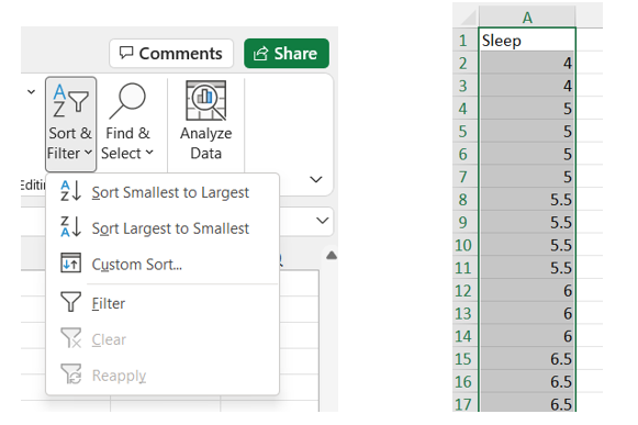
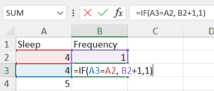
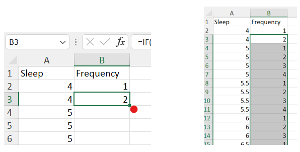
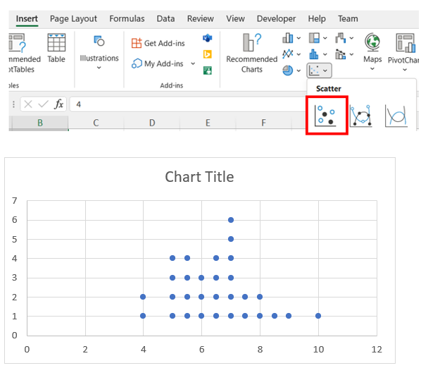
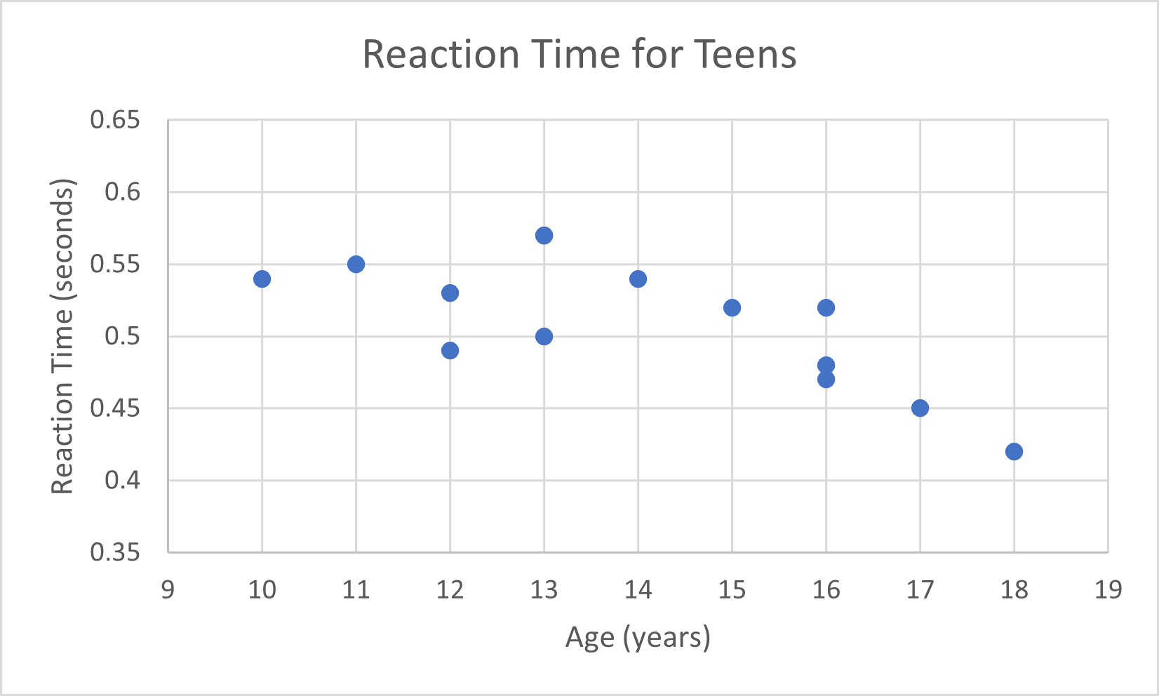
Dot Plot
-
Organize the data for your dot plot into a single column.
-
Highlight the entire column. Under the Home tab, click the Sort & Filter dropdown (on the right side of the toolbar) and select Sort Smallest to Largest. The smallest values should now be at the top of the column.
-
Create a new column next to your data column titled "Frequency". In the first cell of the Frequency column, enter the number 1. In the second cell, enter the following formula (cell references may vary depending on the location of the data in your spreadsheet).
=IF(A3=A2,B2+1, 1)
-
Since our data is sorted, identical values will be in adjacent cells. The above formula will count the number of occurrences of each value. Once you have finished typing the formula into the cell, press Enter, and then double-click the small box at the lower right corner of the cell to apply the formula to the whole column.
-
Now, we will create a scatter plot using our two columns. Highlight all the data in both columns (excluding column headers), then navigate to the Insert tab, and insert a Scatter plot.
-
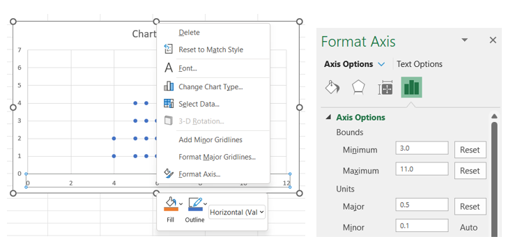
Right-click on the horizontal axis, select Format Axis, and then change the Bounds to fit the range of your data (choose values slightly lower than the minimum and higher than the maximum to leave a small cushion of whitespace on either side). You can also specify the increment of the x-axis by changing the Major Units variable.
-
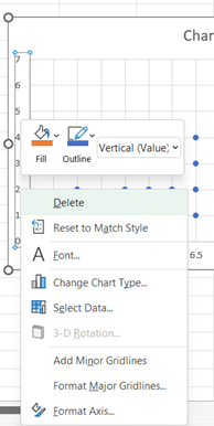
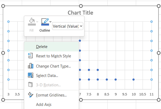
To remove the y-axis and the grid lines, right-click on the vertical axis, select Format Axis, and then Delete.
-
To remove the grid lines, right-click on a vertical grid line in the chart area, select Delete; repeat a similar process to delete the horizontal grid lines.
-
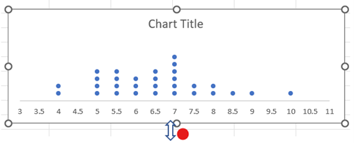
Move the cursor over the middle of the bottom side of the chart area until the double arrow appears. Click and drag to resize the graph so that our dots appear to be stacked on top of one another.
-
You may edit the chart title by clicking on the text of the title. To add a horizontal axis title, click on the chart, select the + icon to the right of the chart, check Axis Titles, and then Primary Horizontal. You may edit the horizontal axis title by clicking on the text of the title.
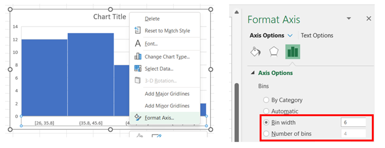
Histogram
-
Organize the data into a column.
-
Select all the data (excluding the column header). Then, under the Insert tab, in the Charts group, select the Histogram symbol.
-
To adjust the width of the bins/classes, right-click on the horizontal axis, select Format Axis, and then change the Bin width to a desired value. There is also an option to adjust the histogram by indicating the Number of bins. Note: The bins are automatically labelled using intervals with ) or ] to indicate the sorting for the endpoints.
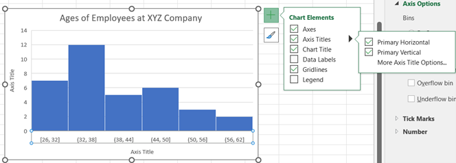
-
You may edit the chart title by clicking on the text of the title. To add an axis title, click on the chart, select the + icon to the right of the chart, check Axis Titles, and then Primary Horizontal and Primary Vertical. You may edit the axis titles by clicking on the text of the title.
-
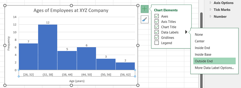
If you want to display the values for the column frequencies, click on the chart, select the + icon to the right of the chart, check Data Labels, and then select the location for the label to appear.
Line Graph
-
Organize the data in adjacent columns, so that corresponding paired data values are in the same row. The values that will be graphed along the horizontal axis appear in the first (left) column, and the values for the vertical axis appear in the second (right) column. (The labels are not required.)
-
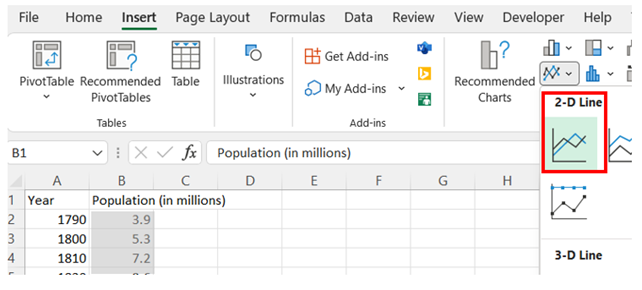
Select the second (right) column of data (excluding the column header). Then, under the Insert tab, in the Charts section, select the Insert Line or Area Chart and the 2-D Line.
-
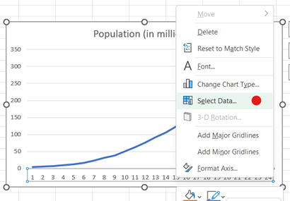
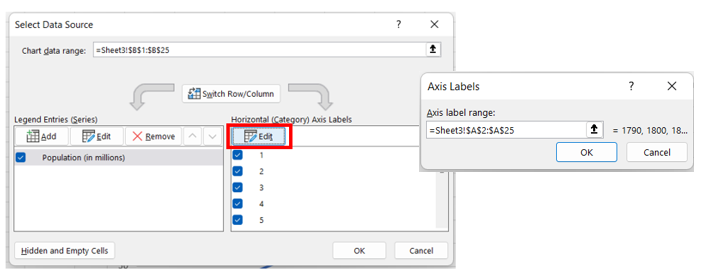
After inserting the graph, right-click on the horizontal axis data labels and choose Select Data. Under the Horizontal (Category) Axis Labels, press Edit and select the range of data in the first (left) column. Click OK and OK.
-
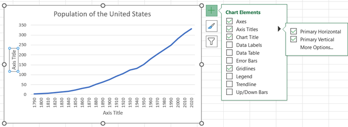
You may edit the chart title by clicking on the text of the title. To add a horizontal axis title, click on the chart, select the + icon to the right of the chart, check Axis Titles, and then Primary Horizontal and Primary Vertical. You may edit the axis titles by clicking on the text of the title.

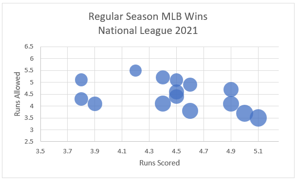
Multivariate/Multidimensional
-
Organize three columns of quantitative data where the first (left) column will be graphed on the horizontal axis, the second (middle) column will be graphed on the vertical axis, and the third (right) column will be represented by the size of the bubbles.
-
Select the data (excluding the column headers). Then, under the Insert tab, in the Charts section, select Insert Scatter (X,Y) or Bubble Chart and choose Bubble chart.

-
Adjust the scale on the axes to “zoom” in on the ranges of the displayed data.
Right-click on the vertical axis, select Format Axis, and then change the Bounds to fit the range of your data (choose values slightly lower than the minimum and higher than the maximum to leave a small cushion of whitespace). You can also specify the increment of the x-axis by changing the Major Units variable.
Repeat this process to adjust the horizontal axis, if necessary.

-
If the bubbles overlap too much, you can scale them down by right-clicking the bubbles, selecting Format Data Series, and reducing the value in Scale bubble size to.

-
You may edit the chart title by clicking on the text of the title. To add a horizontal axis title, click on the chart, select the + icon to the right of the chart, check Axis Titles, and then Primary Horizontal and Primary Vertical. You may edit the axes by clicking on the text of the title.

Normal Probability Plot
-
Enter a column header (label for the data) in A1 and the data below in a single column starting in cell A2.
-
Select Column A. In the Editing portion of the Home menu, use Sort & Filter to Sort Smallest to Largest.
-
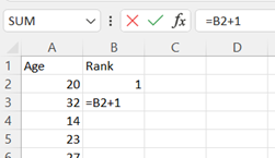
Starting in cell B2, assign a rank to each row of data. A shortcut uses the formula "=B2+1" in cell B3. Press Enter and drag down for all your rows of data. The last entry in this column is equal to n, the number of data points.
-
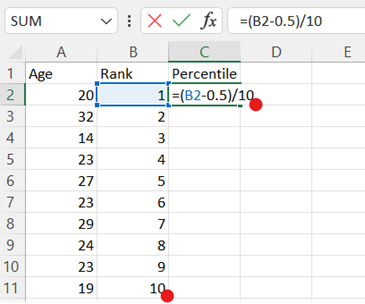
In cell C2, type the formula "=(B2-0.5)/n", replacing n with the number of data points, which can be found as the last entry in the previous column (see Step 3). This will calculate the percentile. Press Enter and drag down for all your rows of data.
-
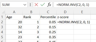
In D2 type the formula "=NORM.INV(C2,0,1)" to calculate the z-score corresponding to each percentile. Press Enter and drag down for all your rows of data.
-
Highlight column A. Then hold the Ctrl key and highlight column D. Under the Insert tab, in the Charts section, select the Insert Scatter and the 2-D Line.
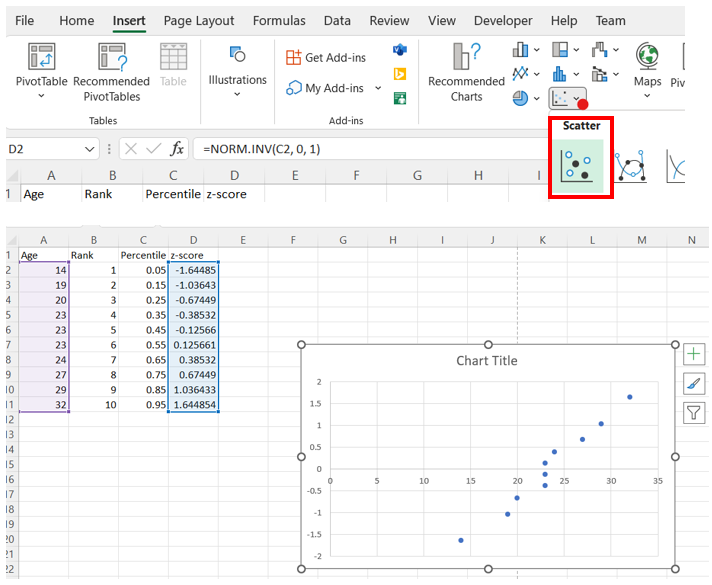
-
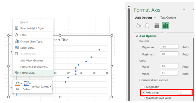
After inserting the graph, right-click on the vertical axis data labels and choose Format Axis. Under Axis Options > Horizontal axis crosses, select Axis value and enter the smallest value shown on the current vertical axis.
-
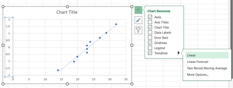
To add a trendline, click on the chart, select the + icon to the right of the chart, check Trendline, and then Linear. The data should closely follow a linear trendline if it is approximately normally distributed.
Pareto Chart
-
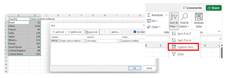
Organize the data into two columns, the labels on the left and the data values corresponding to each label on the right.
-
If the values are not sorted, then select the data in both columns (excluding the column headers), choose Sort & Filter, Custom Sort. Sort the data by the column with the data values (Tickets Sold in the example) and sort largest to smallest.
-
Once the data is sorted, select all the data and then under the Insert tab, in the Charts group, select the Bar Chart symbol. Choose either 2-D Column > Cluster Column (vertical) or 2-D Bar > Cluster Bar (horizontal).
-
You can edit the Chart Title by clicking on it and typing in a new title.
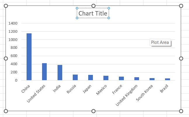
-
To add axis labels, use the Chart Design tab, Add Chart Element and select Axis Titles > Primary Horizontal or Axis Titles > Primary Vertical.


Pie Chart
-
Organize the data into 2 columns, the labels of the categories in the left column and the data values corresponding to each label in the right column. Format these values as percentages if you intend to label the percentages on the graph.
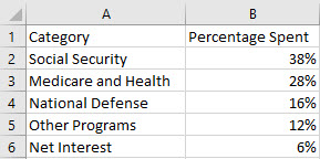
-
Select all the data, including the column headers. Then, under the Insert tab, in the Charts group, select the 2-D Pie chart.
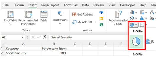
-
To add labels showing the percentages, right-click on the pie chart and select Add Data Labels.
-
You may edit the chart title by clicking on the text of the title.

Scatterplot
-
Organize the data in adjacent columns so that corresponding paired data values are in the same row. Typically, the independent/explanatory variable is located in the first (or left) column and the dependent/response variable is located in the second (or right column).
-
Select the data (excluding the column headers). Then, under the Insert tab, in the Charts section, select the Scatter chart.
-
Adjust the scale on the axes to “zoom” in on the ranges of the displayed data.
Right-click on the vertical axis, select Format Axis, and then change the Bounds to fit the range of your data (choose values slightly lower than the minimum and higher than the maximum to leave a small cushion of whitespace). You can also specify the increment of the x-axis by changing the Major Units variable.
Repeat this process to adjust the horizontal axis, if necessary.
-
You may edit the chart title by clicking on the text of the title. To add a horizontal axis title, click on the chart, select the + icon to the right of the chart, check Axis Titles, and then Primary Horizontal and Primary Vertical. You may edit the axis titles by clicking on the text of the title.
Time Series
-
See Line Graph.
Hypergeometric Distribution
Hypergeometric Distribution
-
Type the formula:
HYPGEOM.DIST(
number of successes (x),
number of trials (n),
number of successes in the population (k),
population size (N),
TRUE for the probability of at most x successes/FALSE for the probability of getting exactly x successes)Note: You may enter a 1 in place of TRUE and a 0 in place of FALSE.
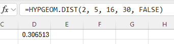
In the example pictured, the student was asked to compute the probability of getting exactly 2 successes out of 5 trials from a population with 16 successes and a size of 30.
Hypothesis Testing
z-Test
-
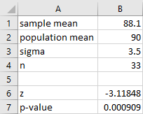
Enter the summary statistics in cells B1 through B4 as follows.
-
In cell B1 enter the sample mean, x̄.
-
In cell B2 enter the population mean, µ.
-
In cell B3 enter the population standard deviation, σ.
-
In cell B4 enter the sample size, n.
-
-
Calculate the test statistic (z).
-
In cell B6 enter: =(B1-B2)/(B3/SQRT(B4))
-
-
Calculate the p-value. Enter the appropriate formula below in cell B7.
-
For a left tailed test: =NORM.S.DIST(B6, TRUE)
-
For a right tailed test: =1-NORM.S.DIST(B6, TRUE)
-
For a two-tailed test: =2*(1-NORM.S.DIST(ABS(B6), TRUE))
-
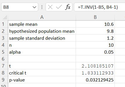
t-Test
-
Enter the summary statistics in cells B1 through B5 as follows.
-
In cell B1 enter the sample mean, .
-
In cell B2 enter the population mean, µ.
-
In cell B3 enter the sample standard deviation, .
-
In cell B4 enter the sample size, .
-
In cell B5 enter the alpha level, .
-
-
Calculate the test statistic (t).
-
In cell B7 enter: =(B1-B2)/(B3/SQRT(B4))
-
-
Compute the t critical value with n−1 degrees of freedom.
-
For a left tailed test: =T.INV(B5, B4-1)
-
For a right tailed test: =T.INV(1-B5, B4-1)
-
For a two-tailed test: =T.INV.2T(B5, B4-1)
-
-
Compute the p-value with n−1 degrees of freedom. The example shown below is a one-tailed test.
-
For a one-tailed test: =T.DIST.RT(ABS(B7), B4-1)
-
For a two-tailed test: =T.DIST.2T(ABS(B7), B4-1)
-
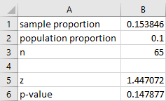
One Proportion z-Test
-
Enter the summary statistics in cells B1 through B3 as follows.
-
In cell B1 enter the sample proportion, .
-
In cell B2 enter the population proportion, .
-
In cell B3 enter the sample size, .
-
-
Calculate the test statistic (z).
-
In cell B5 enter: =(B1-B2)/SQRT(B2*(1-B2)/B3)
-
-
Calculate the p-value. Enter the appropriate formula below in cell B6.
-
For a left tailed test: =NORM.S.DIST(B5, TRUE)
-
For a right tailed test: =1-NORM.S.DIST(B5, TRUE)
-
For a two-tailed test: =2*(1-NORM.S.DIST(ABS(B5), TRUE))
-
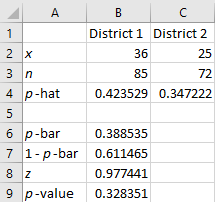
Two Proportion z-Test
-
Enter the statistics for each variable in cells B2 through C3.
-
Calculate and .
-
In cell B4 enter: =B2/B3
-
In cell C4 enter: =C2/C3
-
-
Calculate , and the test statistic (z).
-
In cell B6 enter: =(B2+C2)/(B3+C3)
-
In cell B7 enter: =1-B6
-
In cell B8 enter: =(B4-C4-0)/SQRT(B6*B7*(1/B3+1/C3))
Note that the ‘0’ in the formula above is the presumed value of the difference between the two population means from the null hypothesis.
-
-
Calculate the p-value. Enter the appropriate formula below in cell B9.
-
For a left tailed test: =NORM.S.DIST(B8, TRUE)
-
For a right tailed test: =1-NORM.S.DIST(B8, TRUE)
-
For a two-tailed test: =2*(1-NORM.S.DIST(ABS(B8), TRUE))
-
Two Sample t-Test (Dependent Samples, Paired Difference)
-
Make sure you have the Data Analysis ToolPak Add-in installed.
-
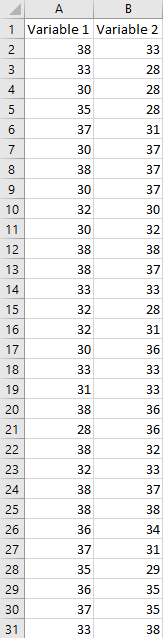
Enter the data for Variable 1 in column A and the data for Variable 2 in column B.
-
Navigate to the Data tab, and select Data Analysis in the Analyze section. In the dialogue box that appears, select t-Test: Paired Two Sample for Means and click OK.
-
-
Enter the Variable 1 Range, the Variable 2 Range, and the Hypothesized Mean Difference.
Note that Excel calculates the paired differences by subtracting the values for Variable 2 from the values for Variable 1, which is the opposite of what we do when we calculate them by hand or using a TI-83/84 Plus calculator.
-
Select Labels if the first cells in your variable ranges are data labels.
-
Enter a value for Alpha.
-
Select Output Range and enter a cell in the spreadsheet for Excel to enter the results.
-Step5.png)
-
-
Click OK.
-Step6.png)
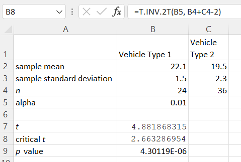
Two Sample t-Test (Independent Samples)
-
Enter the statistics for each variable in cells B2 through C4. Enter a value for alpha in cell B5.
-
Compute the test statistic by entering the following formula in cell B7.
-
If assuming equal variances: =(B2-C2-0)/(SQRT(((B4-1)*B3^2+(C4-1)*C3^2)/(B4+C4-2))*SQRT(1/B4+1/C4))
-
If assuming unequal variances: =(B2-C2-0)/(SQRT((B3^2/B4)+(C3^2/C4)))
Note that the '0'' in the formulas above is the presumed value of the difference between the two population means from the null hypothesis.
-
-
Compute the t critical value with n1 + n2 − 2 degrees of freedom.
-
For a left tailed test: =T.INV(B5, B4+C4-2)
-
For a right tailed test: =T.INV(1-B5, B4+C4-2)
-
For a two-tailed test: =T.INV.2T(B5, B4+C4-2)
-
-
Compute the p-value with n1 + n2 − 2 degrees of freedom. The example shown below is a one-tailed test.
-
For a one-tailed test: =T.DIST.RT(ABS(B7), B4+C4-2)
-
For a two-tailed test: =T.DIST.2T(ABS(B7), B4+C4-2)
-
Two Sample z-Test
-
Make sure you have the Data Analysis ToolPak Add-in installed.
-
Enter the data for Variable 1 in column A and the data for Variable 2 in column B.
-
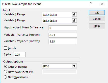
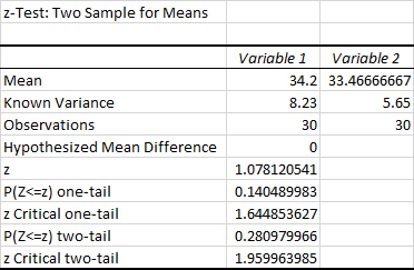
Navigate to the Data tab, and select Data Analysis in the Analyze section. In the dialogue box that appears, select z-Test: Two Sample for Means and click OK.
-
-
Enter the Variable 1 Range and the Variable 2 Range.
-
Enter the Hypothesized Mean Difference, the Variable 1 Variance (known), and the Variable 2 Variance (known).
-
Select Labels if the first cells in your variable ranges are data labels.
-
Enter a value for Alpha.
-
Select Output Range and enter a cell in the spreadsheet for Excel to enter the results.
-
-
Click OK.
Two Sample F-Test
-
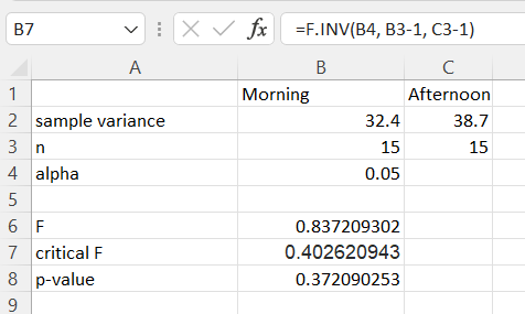
Enter the statistics for each variable in cells B2 through C3. Additionally, enter an alpha value in cell B4.
-
Compute test statistic (F).
-
In cell B6 enter: =B2/C2
-
-
Compute the F critical value(s). Enter the appropriate formula below in cell B7.
-
For a left tailed test: =F.INV(B4,B3-1,C3-1)
-
For a right tailed test: =F.INV.RT(B4,B3-1,C3-1)
-
For a two-tailed test, calculate both the left and right critical values (using Excel formulas shown above) using half of the original alpha value for each.
-
Calculate the p-value. Enter the appropriate formula below in cell B8. The example shown below is a left tailed test.
-
For a left tailed test: =F.DIST(B6,B3-1,C3-1, TRUE)
-
For a right tailed test: =F.DIST.RT(B6,B3-1,C3-1)
-
-
Nonparametrics
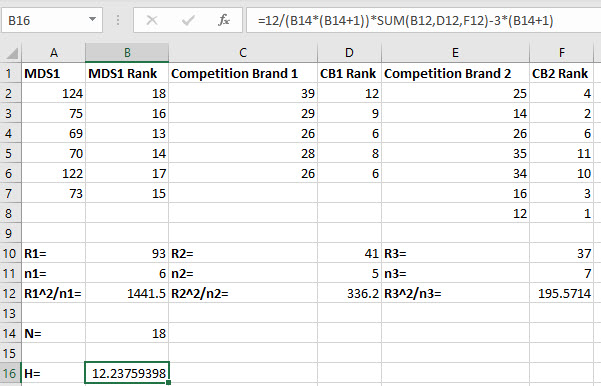
Kruskal-Wallis Test
Note: These instructions assume 3 samples with sizes of 6, 5, and 7. Adjust the rows and columns in the instructions to fit your data.
-
Put the data for the samples in columns A, C, and E (leaving blank columns in between the samples where we will put the ranks in the next step).
-
Determine the ranks (from smallest to largest) for each of the three samples and put them in columns B, D, and F, respectively.
-
In cell B2 type the formula "=RANK.EQ(A2,($A$2:$A$7,$C$2:$C$6,$E$2:$E$8),1)".
Click the small square at the lower-right corner of the cell and drag it down to the bottom row so that the ranks are calculated for all of the values in the first column.
-
In cell D2 type the formula "=RANK.EQ(C2,($A$2:$A$7,$C$2:$C$6,$E$2:$E$8),1)".
Click the small square at the lower-right corner of the cell and drag it down to the bottom row so that the ranks are calculated for all of the values in the second column.
-
In cell F2 type the formula "=RANK.EQ(E2,($A$2:$A$7,$C$2:$C$6,$E$2:$E$8),1)".
Click the small square at the lower-right corner of the cell and drag it down to the bottom row so that the ranks are calculated for all of the values in the third column.
-
-
Compute the sum of the ranks R1, R2, and R3.
-
In cell B10 type the formula "=SUM(B2:B8)".
-
In cell D10 type the formula "=SUM(D2:D8)".
-
In cell F10 type the formula "=SUM(F2:F8)".
-
-
Enter the sample size for the first sample, n1, in cell B11 under the value for R1. Do the same thing for the sample sizes for the other two samples in cells D11 and F11.
-
Enter the squared sum of ranks divided by the sample size, R12/n1, for the first sample by typing '=(B10^2)/B11' in cell B12. Do the same thing for the other two samples in cells D12 and F12.
-
Enter the total number of observations in the samples, N, in cell B14 by typing '=SUM(B11,D11,F11)'.
-
In a new cell, type "=12/(B14*(B14+1))*SUM(B12,D12,F12)-3*(B14+1)" to calculate the test statistic. Press Enter.
-
The value of the test statistic for the Kruskal-Wallis test is shown in cell B16.
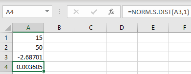
Sign Test
Note: These instructions assume a sample size greater than 25.
-
Enter the values for X and the sample size into cells A1 and A2, respectively.
-
To calculate the test statistic, in cell A3, input the formula "=(A1+0.5-A2/2)/(SQRT(A2)/2)". Press Enter.
-
To calculate the p-value, in cell A4, input the formula "=NORM.S.DIST(A3,1)". Press Enter.
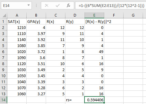
Spearman Rank Correlation Test
-
Put the data for x and y in columns A and B, respectively.
-
Calculate the rank for each data value in the first column (A) by typing "=RANK.AVG(A2,$A$2:$A$13,1)" in cell C2. Click the small square at the lower-right corner of the cell and drag it down to the bottom row so that the ranks are calculated for all of the values in the first column. Repeat this procedure for ranking the second column (B), "=RANK.AVG(B2,$B$2:$B$13,1)" in cell D2.
-
Compute the squared differences by entering "=(C2–D2)^2" in cell E2. Click the small square at the lower-right corner of the cell and drag it down so that the formula is replicated for all the rows in the table.
-
In a new cell, type "=1-((6*SUM(E2:E13))/(12*(12^2-1)))" to calculate Spearman's rho. Press Enter.
Note, if your data does not have 12 data points, adjust the range E2:E13 and the sample size in the denominator of the formula accordingly.
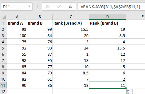
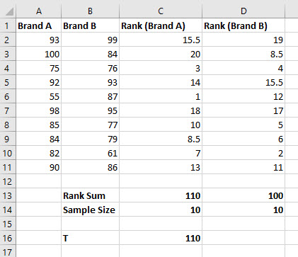
Wilcoxon Rank-Sum Test
Note: These instructions assume samples of size 10. Adjust the number of rows in the instructions to fit your data.
-
Put the data for the samples in columns A and B. Put the name of each sample in the first row and put the data values corresponding to each sample below the column labels.
-
Calculate the rank for each of the data values by typing "=RANK.AVG(A2,$A$2:$B$11,1)" in cell C2. Click the small square at the lower-right corner of the cell and drag it down to the bottom row and to the right by one so that the ranks are calculated for all of the values in the first two columns.
-
In cell C13, sum the ranks of the first sample by entering "=SUM(C2:C11)". Do the same for the second sample by entering "=SUM(D2:D11)" in cell D13.
-
Count the sample size by entering "=COUNT(A2:A11)" in cell C14. Do the same for the second sample by entering "=COUNT(B2:B11)" in cell D14.
-
Since our test is two-tailed and n1 ≤ 10, we know T is the rank sum of the sample with the fewest members. Since both the sample sizes in our example are the same, we will arbitrarily choose the rank sum for the sample in column A. In cell B16, enter the label "T" and then in cell C16 enter the value of T, which is 110 in this example.
-
Compare this value with the values for TL and TU found in the table for critical values of the Wilcoxon Rank-Sum Test.
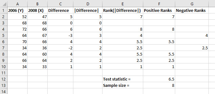
Wilcoxon Signed-Rank Test
Note: These instructions assume samples of size 9. Adjust the number of rows in the instructions to fit your data.
-
Put the data for the samples in columns A and B. Put the name of each sample in the first row and put the data values corresponding to each sample below the column labels.
-
Enter the title Difference in cell C1. Calculate the difference for each of the pairs by typing "=A2-B2" in cell C2. Click the small square at the lower-right corner of the cell and drag it down so that the formula is replicated for all the rows in the table.
-
Enter the title |Difference| in cell D1. Calculate the absolute value of the differences by typing "=ABS(C2)" in cell D2 and copy the formula down the column.
-
Enter the title Rank(|Difference|) in cell E1. Rank the absolute values of the positive differences from smallest to largest (ignore any 0 values and assign the average rank to ties), and put the ranks in column E.
-
Enter the title Positive Ranks in cell F1. Determine the ranks associated with positive differences by typing "=IF(C2>0, E2, "")" in cell F2, and copy the formula down the column.
-
Enter the title Negative Ranks in cell G1. Determine the ranks associated with negative differences by typing "=IF(C2<0, E2, "")" in cell G2, and copy the formula down the column.
-
Calculate the test statistic in a new cell by entering the formula "=MIN(SUM(F2:F10),SUM(G2:G10))".
-
Calculate the sample size in a new cell by entering the formula "=COUNT(F2:G10)".
-
Use the sample size and desired significance level α to look up the critical value for the Wilcoxon Signed-Rank Test in the appropriate table. Compare this to the test statistic calculated in Step 7.
Normal Distribution
Inverse Normal
Standard Normal
-
Type the formula "=NORM.S.INV(probability)". Press Enter.
-
The z-score with area to the left equal to the probability entered is returned.
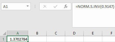
In the example pictured, the student was asked to compute the z-score with an area to the left equal to 0.9147.
Non-standard Normal
-
Type the formula "=NORM.INV(probability, mean, standard deviation)". Press Enter.
-
The x-value with area to its left equal to the probability entered is returned.
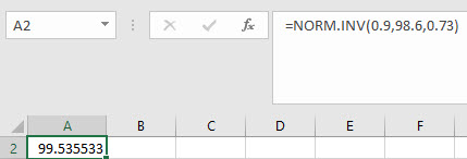
In the example pictured, the student was asked to compute the x-value from a distribution with mean 98.6 and a standard deviation of 0.73, and with area to the left equal to 0.9.
Normal Probability (cdf)
Standard Normal
-
Type the formula "=NORM.S.DIST(z, cumulative)". Choose TRUE for cumulative (cdf). FALSE is for non-cumulative (pdf). Press Enter.
-
The area to the left of the z-score is returned.
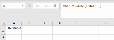
In the example pictured, the student was asked to compute the area to the left of 1.96 on a standard normal distribution.
Non-standard Normal
-
Type the formula "=NORM.DIST(x, mean, standard deviation, cumulative)". Choose TRUE for cumulative (cdf). FALSE is for non-cumulative (pdf). Press Enter.
-
The area to the left of the x-value is returned.
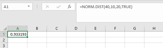
In the example pictured, the student was asked to compute area to the left of 40 on a distribution with mean 10 and standard deviation 20.
Poisson Distribution
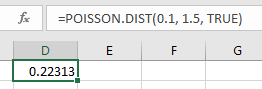
Poisson Probability (cdf)
-
Use the formula "=POISSON.DIST(x, mean, TRUE)". Press Enter.
Note, you may enter a 1 in place of TRUE.
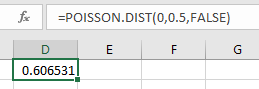
Poisson Probability (pdf)
-
Use the formula "=POISSON.DIST(x, mean, FALSE)". Press Enter.
Note, you may enter a 0 in place of FALSE.
Poisson Probability Distribution
-
Type the column headers.
-
In cell A1, type "x" as the label of the first column.
-
In cell B1, type "Probability" as the label of the second column.
-
-
In column A, type whole numbers for the value of the discrete random variable. Start with "0" in cell A2.
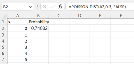
-
In cell B2 type the formula "=POISSON.DIST(A2,mean, FALSE)" to calculate the probability of exactly zero successes for a distribution with the given mean. Press Enter.
See Poisson Probability (pdf) for more information about this formula.
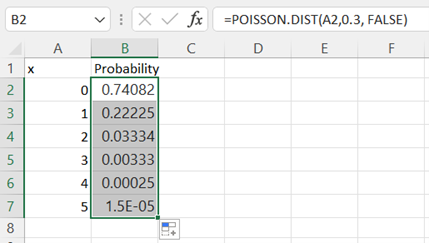
-
Double-click on the lower right corner of cell B2 and drag down the column to populate the remaining cells in column B.
Regression
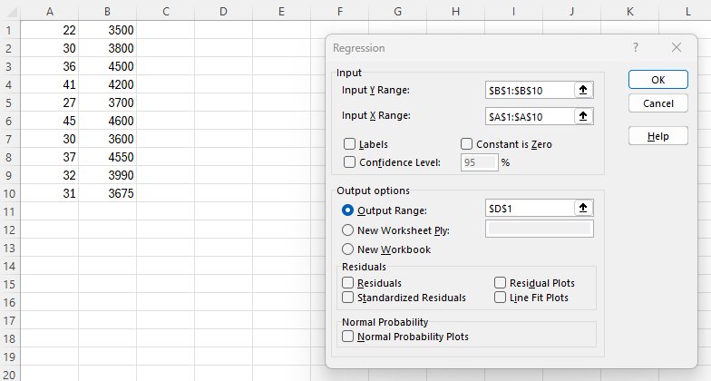
Confidence Intervals for Slope and y-Intercept
-
Make sure you have the Data Analysis ToolPak Add-in installed.
-
Organize the data into two columns. Enter the independent variable (X) in the first column and the dependent variable (Y) in the second column.
-
Navigate to the Data tab, and select Data Analysis in the Analyze section. In the dialogue box that appears, select Regression and click OK.
-
-
Enter the Input Y Range and the Input X Range.
-
Check the Labels box if you included the variable labels in the input range.
-
Check the Confidence Level box and enter the desired numeric value for confidence level percentage.
-
Select Output Range and enter a cell in the spreadsheet for Excel to enter the results.
-
Click OK.
-
-
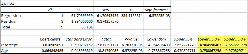
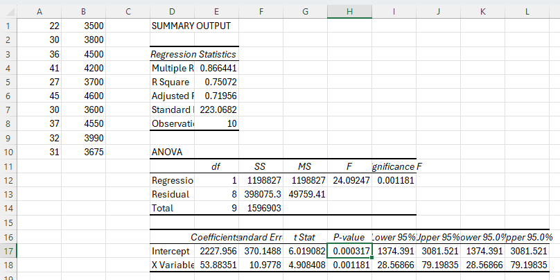
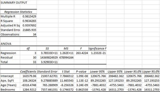
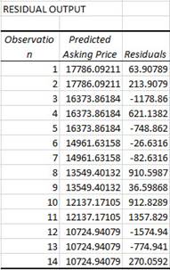
In the example regression output, the Lower 95.0% and the Upper 95.0% columns give the lower and upper endpoints of the 95% confidence intervals for the y-intercept and slope for the independent variable Age (Years).
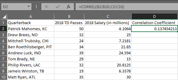
Correlation Coefficient
-
Organize your data into two columns with each row representing an ordered pair.
-
In a separate cell, use the formula "=CORREL(array 1, array 2)" where the arrays are the x and y variable columns of your data, respectfully. Press Enter.
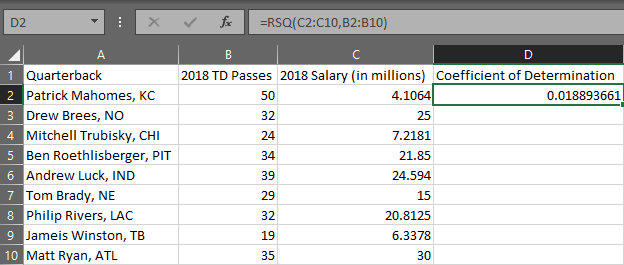
Coefficient of Determination
Simple Linear Regression
-
Organize your data into two columns with each row representing an ordered pair.
-
In a separate cell, use the formula "=RSQ(array 1, array 2)". In this case, the array for the y variable comes first and the array for the x variable is second. Press Enter.
Hypothesis Testing for Slope Coefficient
-
Make sure you have the Data Analysis ToolPak Add-in installed.
-
Organize the data into two columns. Enter the independent variable (X) in the first column and the dependent variable (Y) in the second column.
-
Navigate to the Data tab, and select Data Analysis in the Analyze section. In the dialogue box that appears, select Regression and click OK.
-
-
Enter the Input Y Range and the Input X Range.
-
Check the Labels box if you included the variable labels in the input range.
-
Select Output Range and enter a cell in the spreadsheet for Excel to enter the results.
-
Click OK.
-
-
In the example regression output, the P-value column gives the p-value for the y-intercept.
Multiple Regression
-
Make sure you have the Data Analysis ToolPak Add-in Installed.
-
Enter your response values into the first column and each of your predictor values in the next columns. Label your columns.
-
Navigate to the Data tab, and select Data Analysis in the Analyze section. In the dialogue box that appears, select Regression and click OK.
-
-
Enter the Input Y Range and the Input X Range. (Note the X-variables must be in contiguous columns.)
-
Check the Labels box if you included the variable labels in the input range.
-
Select Output Range and enter a cell in the spreadsheet for Excel to enter the results.
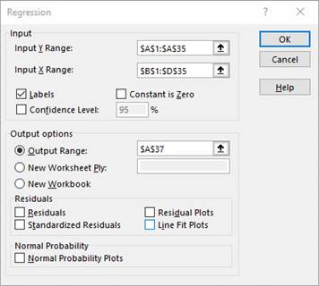
-
-
Click OK.
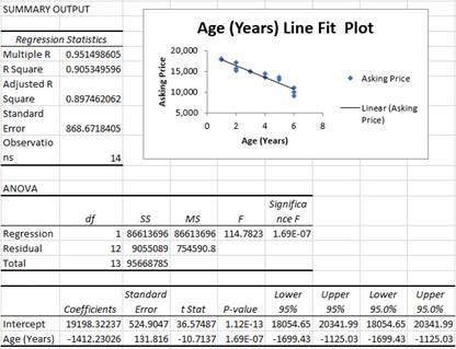
Simple Linear Regression
-
Make sure you have the Data Analysis ToolPak Add-in Installed.
-
Organize the data into two columns. Enter the independent variable in the first column (left) and the dependent variable in the second column (right).
-
Navigate to the Data tab, and select Data Analysis in the Analyze section. In the dialogue box that appears, select Regression and click OK.
-
-
Select the second column for the Y values, and the first column for the X values.
-
If you have labels in the first cell of the columns, check the box that says Labels.
-
Select Output Range and enter a cell in the spreadsheet for Excel to enter the results.
-
Check the box at the bottom that says Line Fit Plots.
-
-
Click OK.
Sampling
Random Samples
-
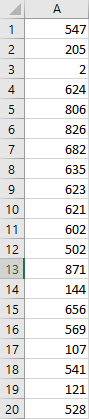
In cell A1 type the formula "=RANDBETWEEN(1, 897)" for example. 1 represents the smallest possible number to generate and 897 the largest.
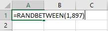
-
Place the cursor over the bottom right-hand corner of cell A1, click and drag the box down as many rows as random numbers you desire.
t-Distribution
Inverse t
Area in one tail
-
Type the formula "=T.INV(probability, degrees of freedom)". Press Enter.
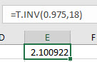
In the example pictured, the student was asked to compute the t-value on a Student's t distribution with 18 degrees of freedom and an area of 0.975 to the left of the t-value.
Area in two tails
-
Type the formula "=T.INV.2T(probability, degrees of freedom)". Press Enter.
Note that the area in two tails is one minus the area between symmetric t-values.
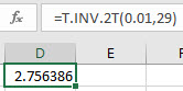
In the example pictured, the student was asked to compute the positive t-value on a Student's t distribution with 29 degrees of freedom such that half the given area, 0.01, is to its right.
t-Probability (cdf)
-
Type the formula "=T.DIST(x, degrees of freedom, TRUE)". Press Enter.
The area to the left of the x-value is returned.
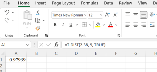
In the example pictured, the student was asked to compute the area to the left of 2.38 on a Student's t distribution with 9 degrees of freedom.
Time Series
Adjusted Exponential Smoothing
-
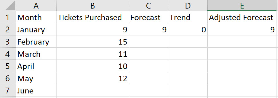
Enter the values for the time period in column A, enter the values for the response variable in column B, and include labels in row 1 of the spreadsheet
-
-
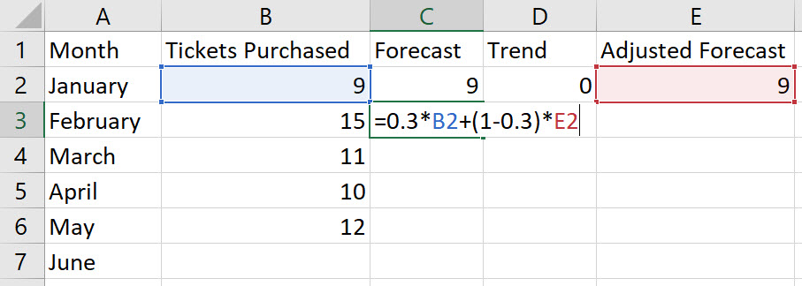
In cells C1, D1, and E1, name the columns Forecast, Trend, and Adjusted Forecast, respectively.
-
Enter the initial forecast in cell C2; enter the initial trend, 0, in cell D2; and initial adjusted forecast in cell E2.
-
-
In cell C3, type the formula "=alpha*B2+(1-alpha)*E2", replacing a value for the word "alpha". Press Enter.
Note, F2 = α*(D1) + (1 – α)*(AF1).
-
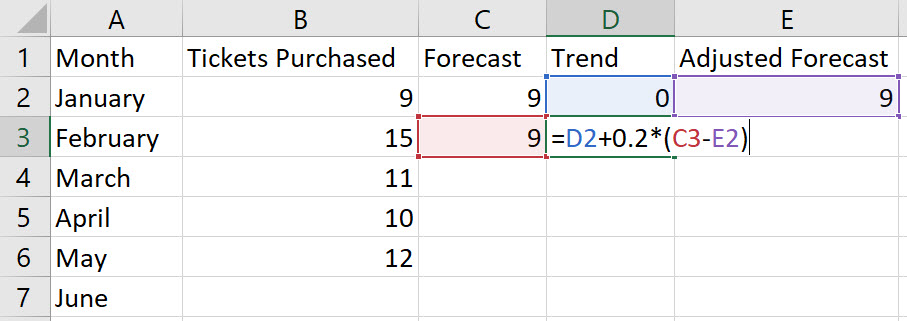
In cell D3, type the formula "=D2+beta*(C3-E2)", replacing a value for the word "beta". Press Enter.
Note, Tt+1= Tt-1 + β*(Ft– AFt-1).
-
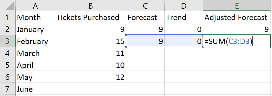
In cell E3, type the formula "=SUM(C3:D3)". Press Enter.
-
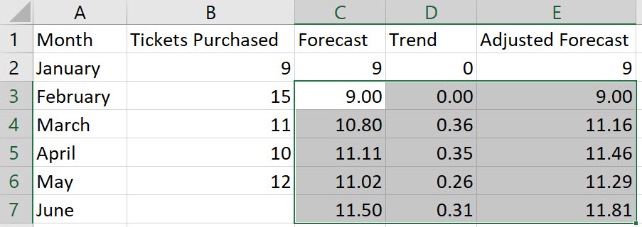
We have performed calculations in row 3 that need to be repeated for all other rows. Select the cells from C3 to E3 and double-click on the bottom-right corner of cell E3. Thus, autofilling the values in the remaining rows.
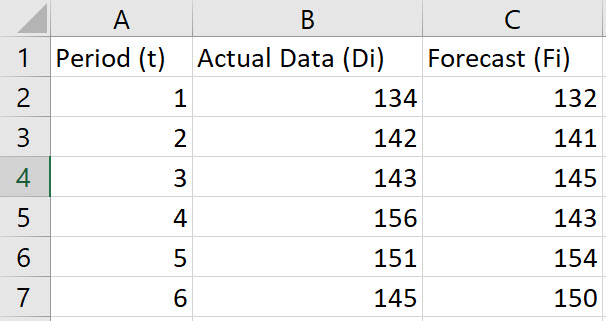
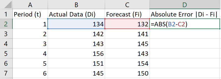
Mean Absolute Percentage Error (MAPE)
-
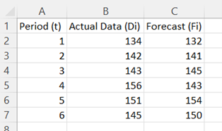
Enter the values for the Period (t), Actual Data (Di), and Forecast (Fi) in Columns A, B, and C, respectively. Include labels in row 1 of the spreadsheet.
-
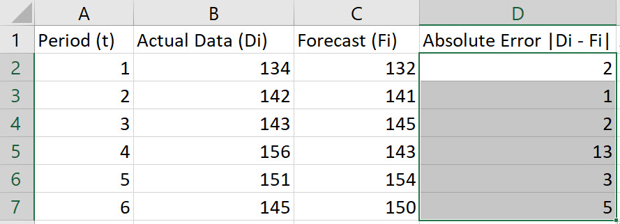
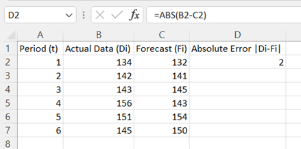
In cell D2, type the formula "=ABS(B2-C2)". Press Enter.
Note, the Absolute Error is given by |Di-Fi|.
-
Double-click on the bottom-right corner of cell D2 so that the formula autofills the column.
-
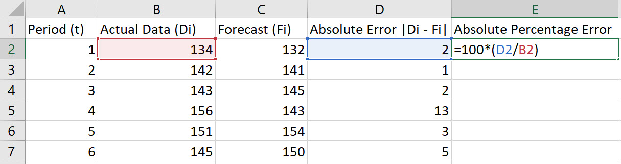
In cell E2, type the formula "=100*(D2/B2)". Press Enter.
Note, the Absolute Percentage Error is given by 100*|Dt - Ft|/Dt.
-
Double-click on the bottom-right corner of cell E2 so that the formula autofills the column.
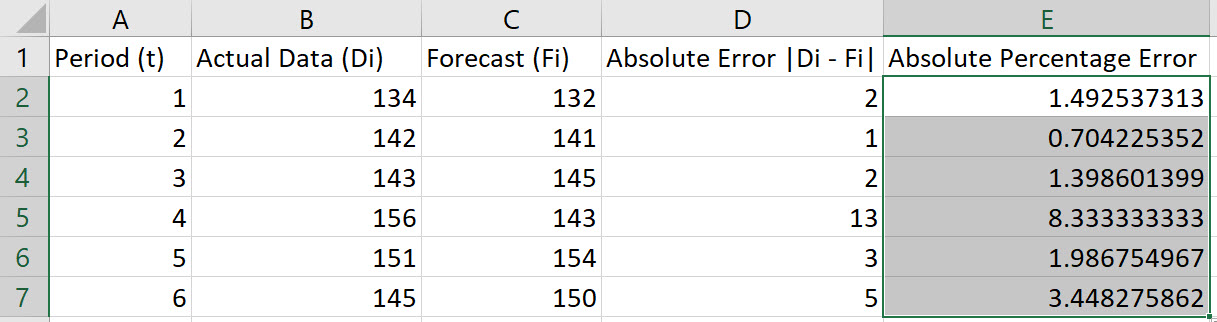
-
To compute the MAPE, choose an empty cell and type the formula "=AVERAGE(E2:E7)". Press Enter.
Note: These instructions assume data in rows 2 through 7. Adjust the rows in the instructions to fit your data.
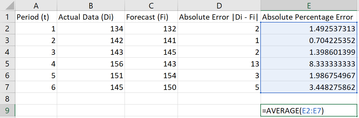
In the example shown, the MAPE is 2.8939.
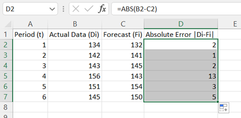
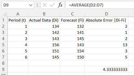
Mean Absolute Deviation
-
Enter the values for Period (t), Actual Data (Di), and Forecast (Fi) in Columns A, B, and C, respectively. Include labels in row 1 of the spreadsheet.
-
In cell D2, type the formula "=ABS(B2-C2)". Press Enter.
Note, Absolute Error is given by |Di - Fi|.
-
Double-click on the bottom-right corner of cell D2 to populate the remaining values in column D.
-
To compute the MAD, choose an empty cell and type the formula "=AVERAGE(D2:D7)". Press Enter.
Note: These instructions assume data in rows 2 through 7. Adjust the rows in the instructions to fit your data.
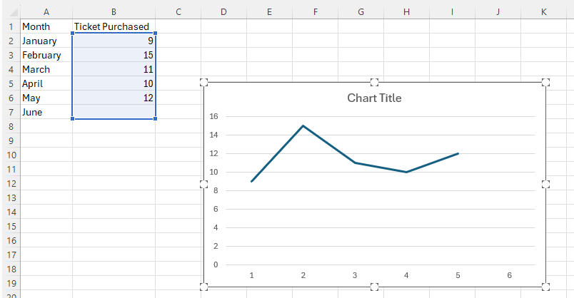
Moving Average Plot
Method 1
-
Enter the values for the time period in column A, enter the values for the response variable in column B, and include labels in row 1 of the spreadsheet
-
Select the second (right) column of data (excluding the column header). Then, under the Insert tab, in the Charts section, select the Insert Line or Area Chart and the 2-D Line.
For more information about making a line graph, see Line Graph.
-
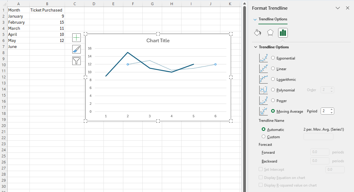
Click anywhere on the chart, select the + icon to the right of the chart, click on the > arrow to the right of Trendline, and then select More Options....
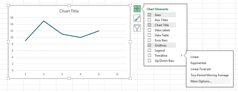
-
The Format Trendline pane will appear. Select Moving Average and enter your desired period in the box on the right.
Note, if your desired period is 2. Then, in the previous step, you may select Two Period Moving Average instead of More Options...
Method 2
-
Make sure you have the Data Analysis ToolPak Add-in installed.
-
Enter the values for the time period in column A, enter the values for the response variable in column B, and include labels in row 1 of the spreadsheet
-
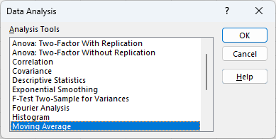
Navigate to the Data tab, and select Data Analysis in the Analyze section. In the dialogue box that appears, select Moving Average and click OK.
-
-
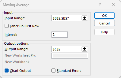
Provide the Input Range (in this example, cells B2:B7).
-
Enter the desired Interval, that is the desired period.
-
Select Output Range and enter a cell in the spreadsheet for Excel to enter the results (in this example, cell C2).
-
-
Click OK.
Note, both the moving average data and the chart are displayed.
Mean Squared Error (MSE)
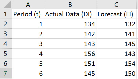
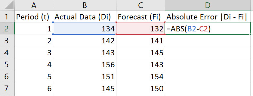
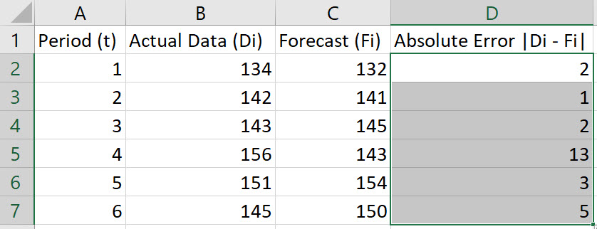
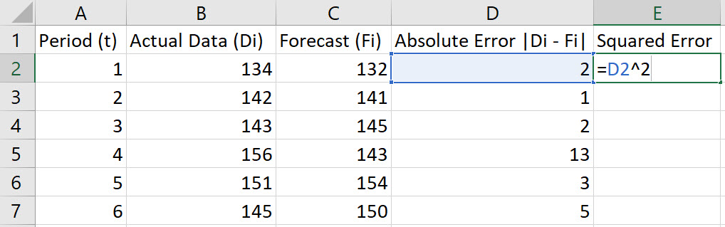
-
Enter the values for Period (t), Actual Data (Di), and Forecast (Fi) in Columns A, B, and C, respectively. Include labels in row 1 of the spreadsheet.
-
In cell D2, type the formula "=ABS(B2-C2)". Press Enter.
Note, the Absolute Error is given by |Di-Fi|.
-
Double-click on the bottom-right corner of cell D2 to populate the remaining values in column D.
-
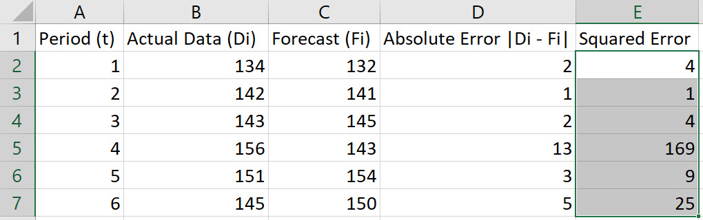
In cell E2, type the formula "=D2^2". Press Enter.
-
Double-click on the bottom-right corner of cell E2 to populate the remaining values in column E.
-
To compute the MSE, choose an empty cell and type the formula "=AVERAGE(E2:E7)". Press Enter.
Note: These instructions assume data in rows 2 through 7. Adjust the rows in the instructions to fit your data.
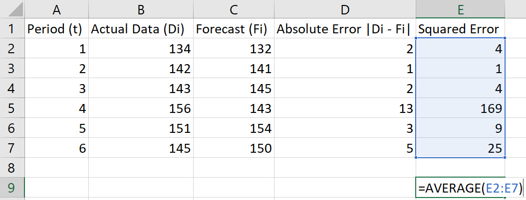
In the example shown, the MSE is 35.3333.
Simple Exponential Smoothing
Method 1
-
Enter the values for the time period in column A, enter the values for the response variable in column B, and include labels in row 1 of the spreadsheet
-
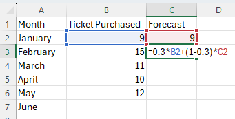
-
In cell C1, name the column Forecast.
-
Enter the initial forecast in cell C2.
-
-
In cell C3, type the formula "=alpha*B2+(1-alpha)*C2", replacing a value for the word "alpha". Press Enter.
Note, F2 = α*(D1) + (1 – α)*(AF1).
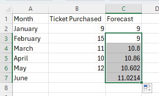
-
Double-click on the bottom-right corner of cell C3 to populate the remaining values in column C.
Method 2
-
Make sure you have the Data Analysis ToolPak Add-in installed.
-
Enter the values for the time period in column A, enter the values for the response variable in column B, and include labels in row 1 of the spreadsheet
In cell C1, insert the label "Forecast".
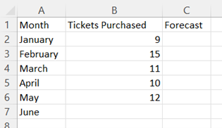
-
Navigate to the Data tab, and select Data Analysis in the Analyze section. In the dialogue box that appears, select Exponential Smoothing and click OK.
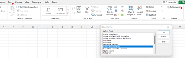
-
-
Provide the Input Range (in this example, cells B2:B7).
-
Enter the Damping factor, 1-α (in this example, α = 0.3)
-
Select Output Range and enter a cell in the spreadsheet for Excel to enter the results (in this example, cells C2:C7).
-
-
Click OK.
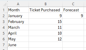
Simple Moving Average
-
Enter the values for the time period in column A, enter the values for the response variable in column B, and include labels in row 1 of the spreadsheet
-
In cell C7, type the formula "=AVERAGE(B4:B6)". Press Enter.
Note: In the example pictured, the student was asked to compute a 3-month moving average for June. For a different time period, change the cell range accordingly inside the AVERAGE function.
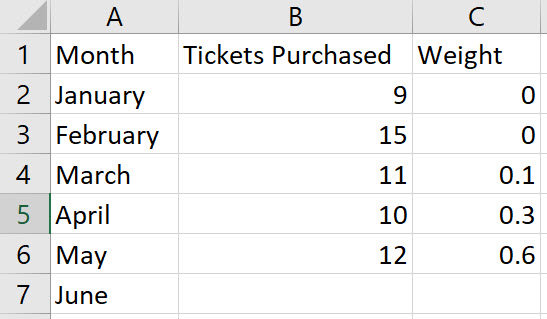
Weighted Moving Average
-
Enter the values for the time period in column A, enter the values for the response variable in column B, enter the weight for each time period in column C, and include labels in row 1 of the spreadsheet
Note, the weights in Column C should add to 1.
-
In cell D7, type the formula "=SUMPRODUCT(B4:B6,C4:C6)". Press Enter.
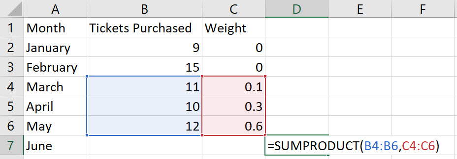
Note: In the example pictured, the student was asked to compute a 3-month weighted moving average for June. The result is 11.3. For a different time period, change the cell range accordingly inside the SUMPRODUCT function.